


What is Data Visualization?
Storytelling is at the heart of Data Visualization. Regardless of the type of information or data, there is always a tale to tell. Thus, Data Visualization could be defined as the art of using graphics encoded with data to convey some unseen insight or understanding. Below are a few examples of types of visualizations you might create.
- Outliers — Outliers identify data that is outside the "norm" of what you'd expect to see. Using different colors is a great way to highlight potential outlier data points.

- Trends or Relationships — Regressions lines (red below) help the reader understand how strong or weak the relationship between two variables is.

- Groups or Clusters - Clusters help you identify sub-groups within your datasets. Color can provide clarity where you may not have seen it before by showing how information is grouped.

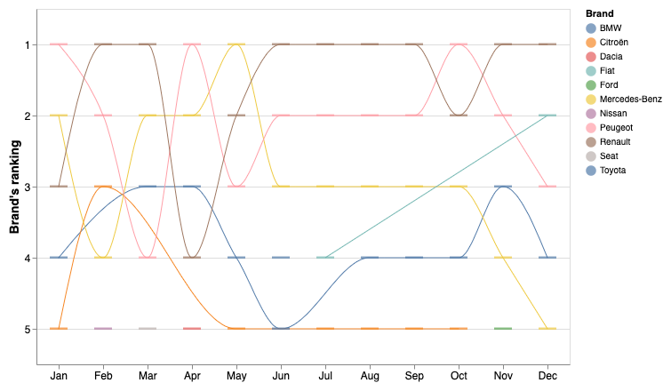
- Rankings — Line charts can be used to help show how the order of data may change over time.
- Interactions — Interactivity is a great way to allow your end user to engage with the data and ask their questions.
What is the purpose of Data Visualization?
Visualizing data is built around the idea of simplifying the complex. Have you ever tried explaining how something technical works to anyone else? It rarely goes well. The best way to share your technical idea with anyone else is by creating a visual representation of what you’re describing, so it’s easier for their brains to digest it. We’re trying to convey ideas and if they don’t get it, then you’ve missed an opportunity to share what you’ve learned. A picture, or in this case, a chart, is worth a thousand words.
How does Data Visualization fit within Data Science?
While it may appear that Data Visualization primarily falls within the Communicate section of the Data Science flow diagram in R4DS (seen below), it is used throughout the whole process. The only different thing is the audience. You will want to see what you are doing along the way, while your end user will typically care about the end product.

Below are 3 scenarios for visualizing data throughout the Data Science process.
1). Before we can build cool charts, we must first get familiar with our data. Below are a few questions you may need to answer first:
How many blanks or nulls are in each column?
What types are in a particular column (i.e., string, int, float, etc…)?
What data is missing?
Is there enough data in a column to even use it?
2). When you’re working with models, you will want to see how well the models represent the data. Below are 2 different types of regressions that work slightly differently.
- Linear Regression

- Loess Regression

3). After you’ve selected a model, you will want to know how well it is performing at predicting future events.
For regressions, you may want the R2, as shown in the linear regression above.
For classification, you may want to see the ROC (Receiver Operating Characteristic) curve.

What library are we going to use?
As we move forward, we’ll be using the Vega-Lite library to create all our charts and graphics. Vega-Lite describes itself as “A High-Level Grammar of Interactive Graphics”. What does that mean? Let’s break it down into 3 sections.
1). What is High-Level?
High-level is in relation to Vega or D3.js. Both are libraries that Vega-Lite is built upon. The “level” refers to the detail and code needed to generate a graph. Vega-Lite requires far less code than either of the other libraries.
2). What is the "Grammar of Graphics"?
It is a framework to approach the creation of graphics by breaking every chart down into its most basic building blocks. The framework was originally popularized by Leeland Wilkinson in his book titled “The Grammar of Graphics”.
Below is an image depicting the primary layers used to create a chart using the Grammar of Graphics framework.

The benefit here is that instead of describing how to create your chart (i.e., calculating where to position each element). You describe what you want to see. Simply pass the data and tell the framework what to visualize. For example, there is no need to figure out how to calculate different coordinate types.


3). What About Interactivity?
The Vega-Lite team has extended the original Grammar of Graphics to include a layer for interactivity. They define their building blocks for interaction as Parameters. Parameters can be either simple variables that change a specific feature or complex selections as shown below.
- Simple Variable
- Complex Selection
5 of the most common building blocks you’ll use in VegaLite are:
Data — Read information in
Scales — Transform the data into the right domain
Axes — Define the lines, ticks, and labels
Legends — Provide context to the visuals
Marks — Specify the shape to be displayed
How do you get started?
Before you can get started, you will need to first install a few packages for Elixir.
VegaLite — Create charts
Kino_Vega_Lite — Makes VegaLite render in Livebook
Kino — Interactive Livebook widgets
Explorer — Manipulate and clean data with DataFrames
With Livebook, installation is simple. All you need to do is search for the packages you want and click the “Setup” button to install them.
Note: The VegaLite package is a simple wrapper around the original Vega-Lite JavaScript library so that the Elixir community didn’t have to re-create it from scratch.
Wrapping Up
Data Visualization is an important process for simplifying complex ideas and allows us to communicate our findings with others and ourselves. It is not simply for generating reports, but for communication along the whole Data Science process. In the next section, we’ll be looking at how to get started with reading data into Livebook and then making a basic chart.